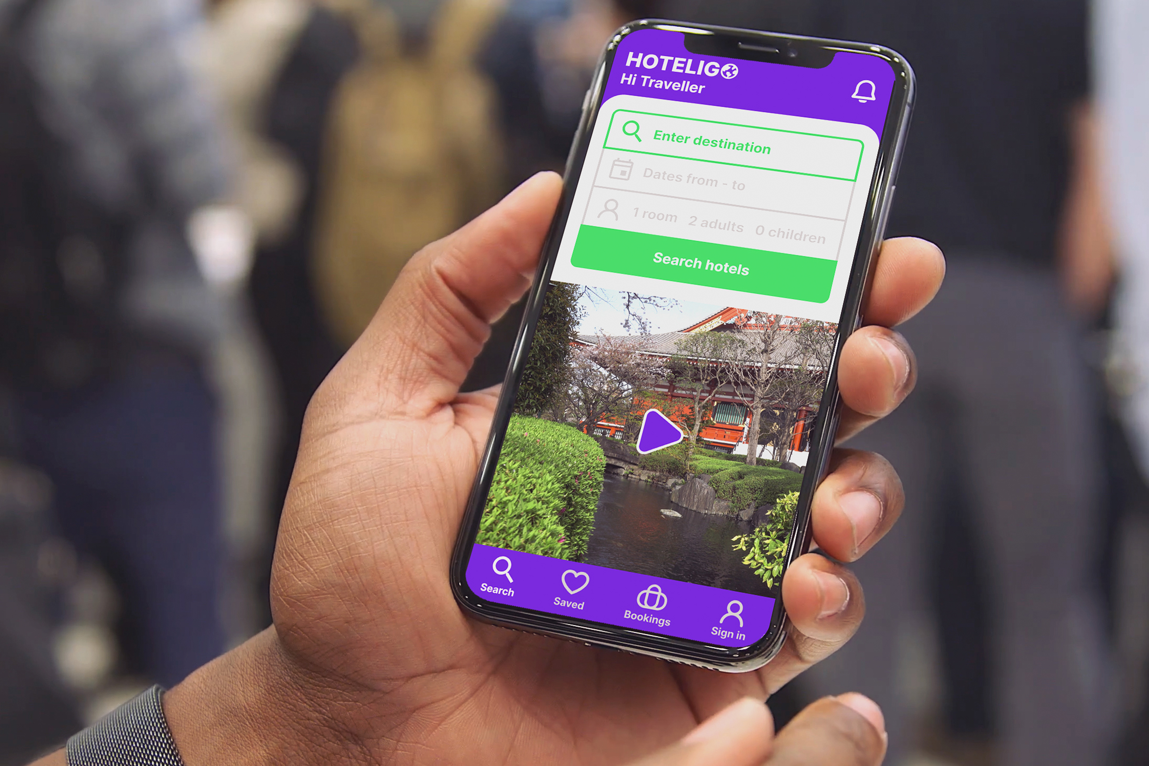
A streamlined hotel booking experience for faster, smarter accommodation selection
Hoteligo was a startup project aiming to disrupt the hotel booking market dominated by giants like Booking.com, Expedia, and Airbnb. The challenge was to design a booking app that reduced user frustration, built trust through transparency, and sped up the booking process by surfacing meaningful information like reviews, videos, and pricing upfront.
Deliverables: UX Research, Product Design, High-Fidelity Prototype, Developer Handoff
Team: Product Designer (me)
Timescale: 1 month
Team: Product Designer (me)
Timescale: 1 month
Business Goal
Help Hoteligo stand out in a saturated space by creating a booking experience grounded in transparency, decision support, and speed — leveraging integrated Trustpilot reviews, destination videos, and smart pricing defaults.
User Impact Goal
Enable travellers to make confident booking decisions quickly, without getting overwhelmed by clutter, hidden fees, or irrelevant filters.

ui/ux design
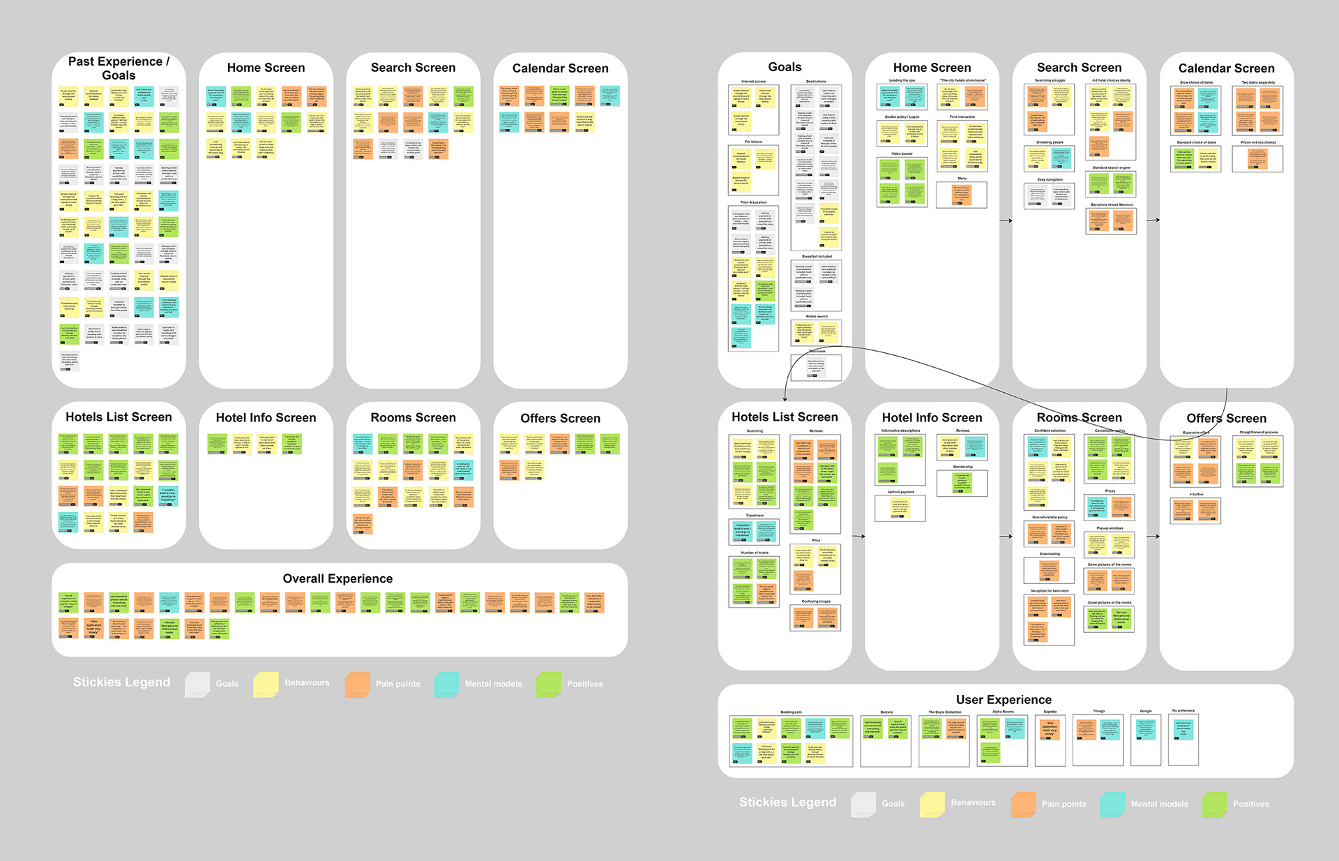
grouping research information
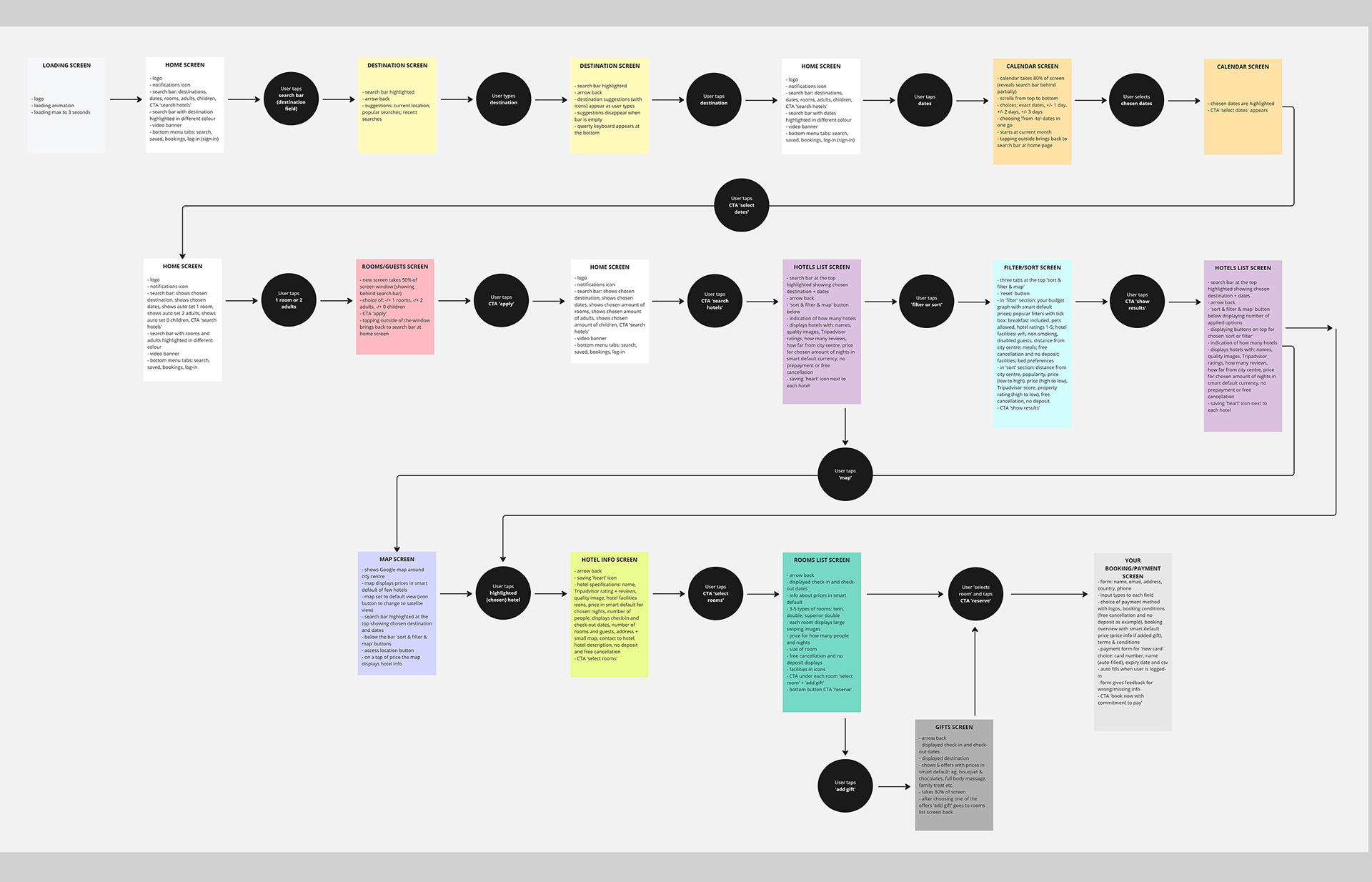
users happy path
Design Process
01/ Usability Testing of Competitors
Analyzed usability test recordings for Barcelo and Doyle Collection apps, then conducted my own session with a participant on Booking.com and Expedia.
Tasks included searching, selecting dates, and booking accommodation.
Findings:
- Users felt overwhelmed by filters and unclear pricing.
- Lack of integrated reviews reduced trust.
- Date pickers often caused frustration.
- Hotel pages had too much text and little visual inspiration.
Key Insight: Users want a fast, transparent way to decide - not endless searching.
02/ Grouping Research & Journey Mapping
Collected insights in Miro, grouping notes by goals, behaviours, pain points, and positives.
Mapped the user journey, adding emotional states at each stage.
Example: frustration when reviews were missing, delight when hotel imagery was present.
Defined the “happy path”: launch app → search → filter → review info → book with minimal friction.
03/ Design Opportunities Identified
Trust signals: integrate TripAdvisor scores.
Inspiration: homepage with destination videos.
Efficiency: single-scroll date selection.
Transparency: smart default pricing per country.
Decision support: realistic hotel room imagery.
04/ Wireframing & Interaction Sketches
Sketched key screens: home, calendar, hotel list, hotel details, booking flow.
Prioritized readability, hierarchy, and contextual information.
Used flow diagrams to ensure logic and consistency across states.
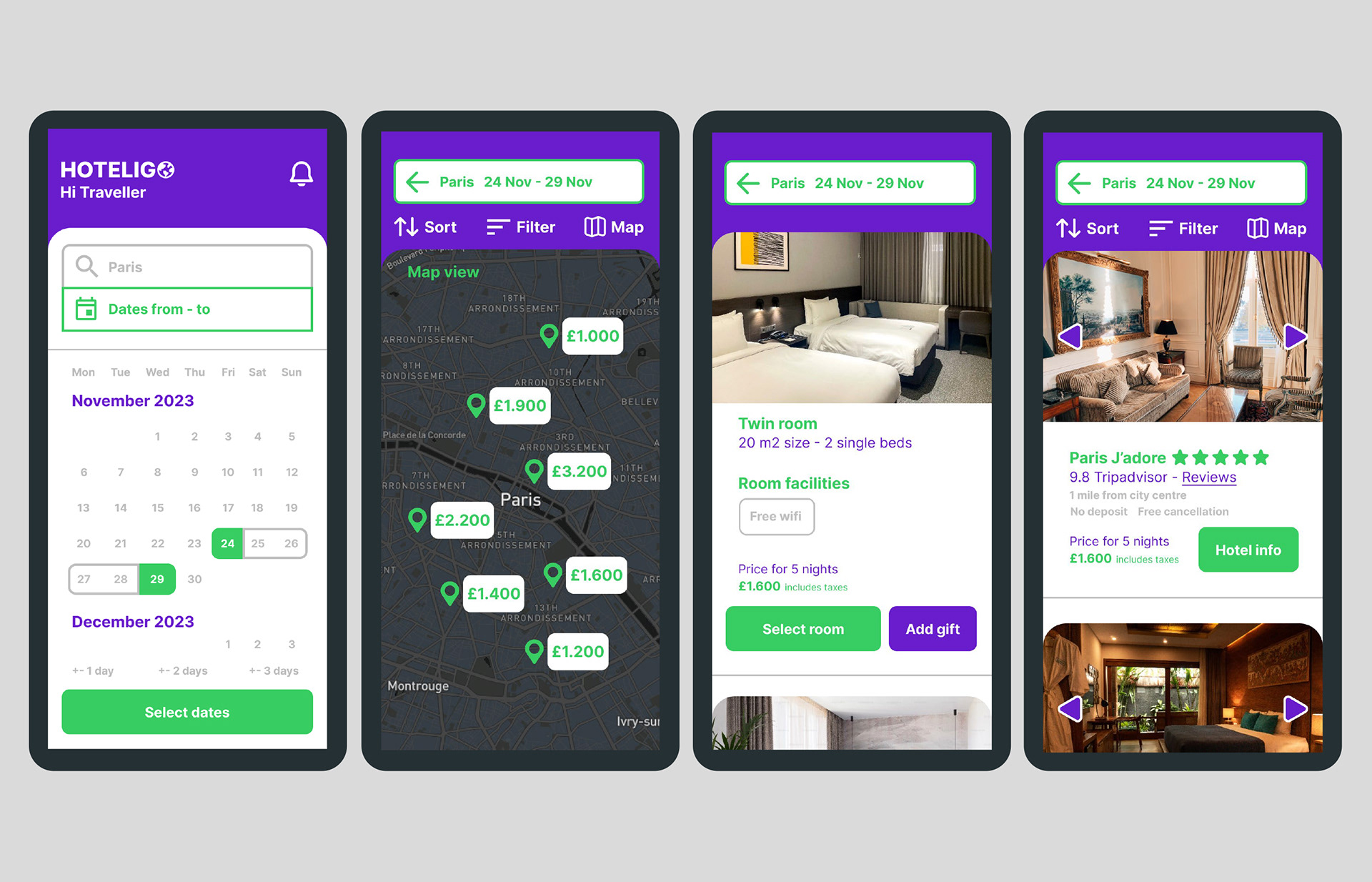
05/ High-Fidelity Prototype
Developed a prototype in Figma integrating brand identity, colors, and typography.
Designed features such as filterable maps, review integration, and image carousels.
Focused on minimal yet engaging layouts — balancing information richness with clarity.
06 / Developer Handoff & Annotation
Created detailed annotations for each screen: button logic, filter behaviour, carousel interactions, error states.
Example: specifying how sorting options update results in real-time.
Ensured developers had clarity on static vs dynamic components to avoid ambiguity.

sketches of users interactions
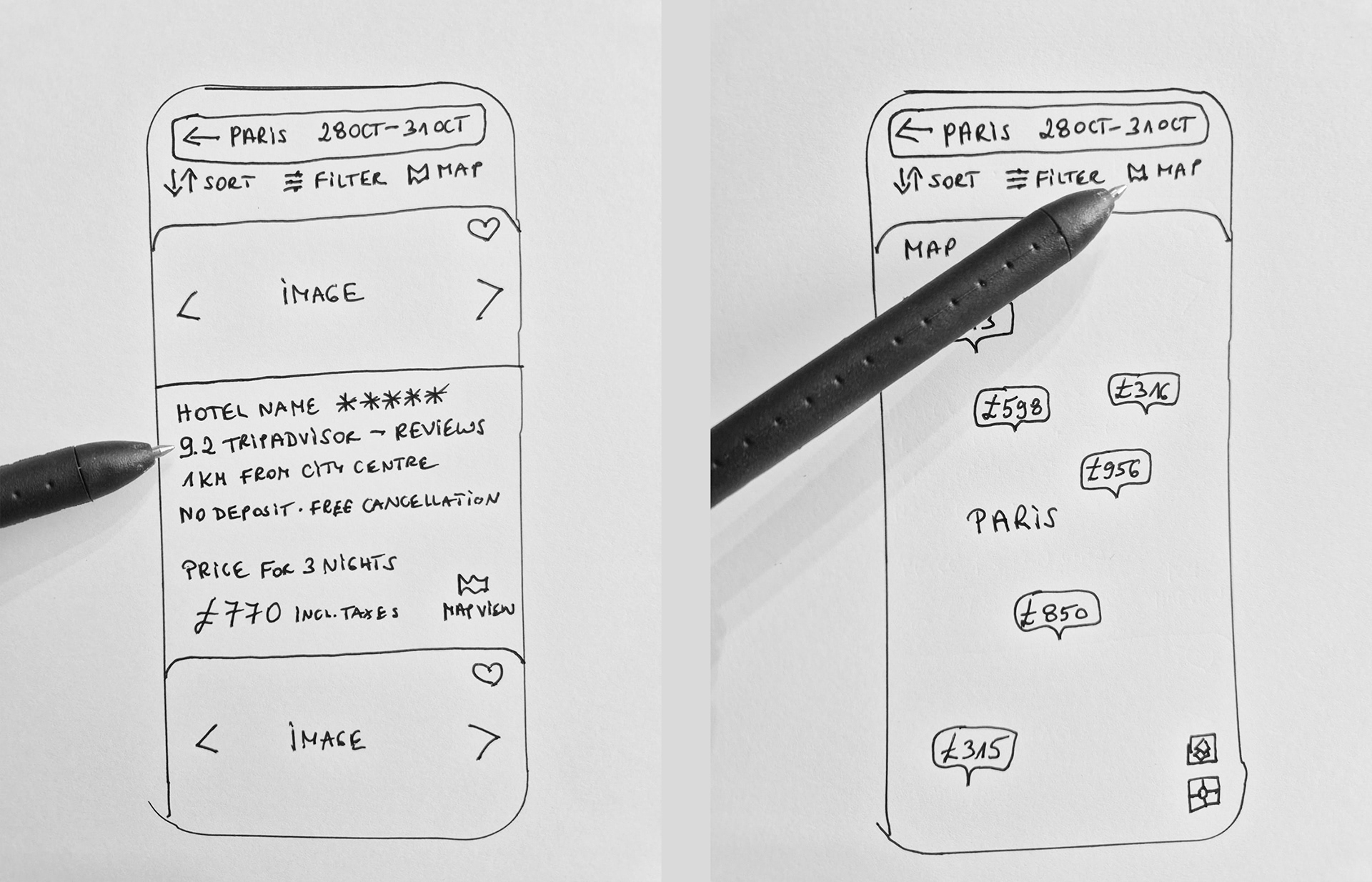
sketches of users interactions
ui/ux prototype
Outcomes & Insights
Streamlined flow: Mapping the “happy path” reduced booking steps, making it possible to complete a booking with fewer clicks.
Trust by design: Foregrounding TripAdvisor reviews and realistic room imagery gave users more confidence in decision-making.
Efficiency improvements: Prototype testing showed faster task completion compared to baseline competitor flows.
Design maturity: Produced a developer-ready prototype with clear interaction rules and component specs.
Next Steps
Run full usability testing with at least 5 participants to validate flows and discover edge cases.
Test multiple variants of the homepage and booking screen through A/B testing.
Integrate analytics tracking to evaluate time-to-booking and drop-off points.
Expand features: loyalty rewards, saved searches, social trip sharing.
Lessons Learned
Prototyping with adjustable variables in Figma would have enabled more robust testing of edge cases.
Iterative usability testing earlier in the prototype phase could have uncovered more issues.
Building in a startup context highlighted the tension between big product ambitions and limited time/funding. This reinforced the importance of prioritization and lean MVP delivery.
Round-Up
Hoteligo was a startup project where I applied end-to-end UX design thinking - from competitor testing and journey mapping to prototyping and developer-ready specifications. By focusing on trust, speed, and decision support, the design demonstrates how even in a saturated market, thoughtful UX can create meaningful differentiation.